luxury italian fabrics is the right starting point for a dressing room discussion when the question is not color but optical behavior. Silk velvet does not read like flat cloth. It changes with viewing angle, pile direction, and the type of light that reaches it. In a dressing room this matters because mirrors multiply reflected surfaces and make shallow material differences look much larger than they do in a sample book.
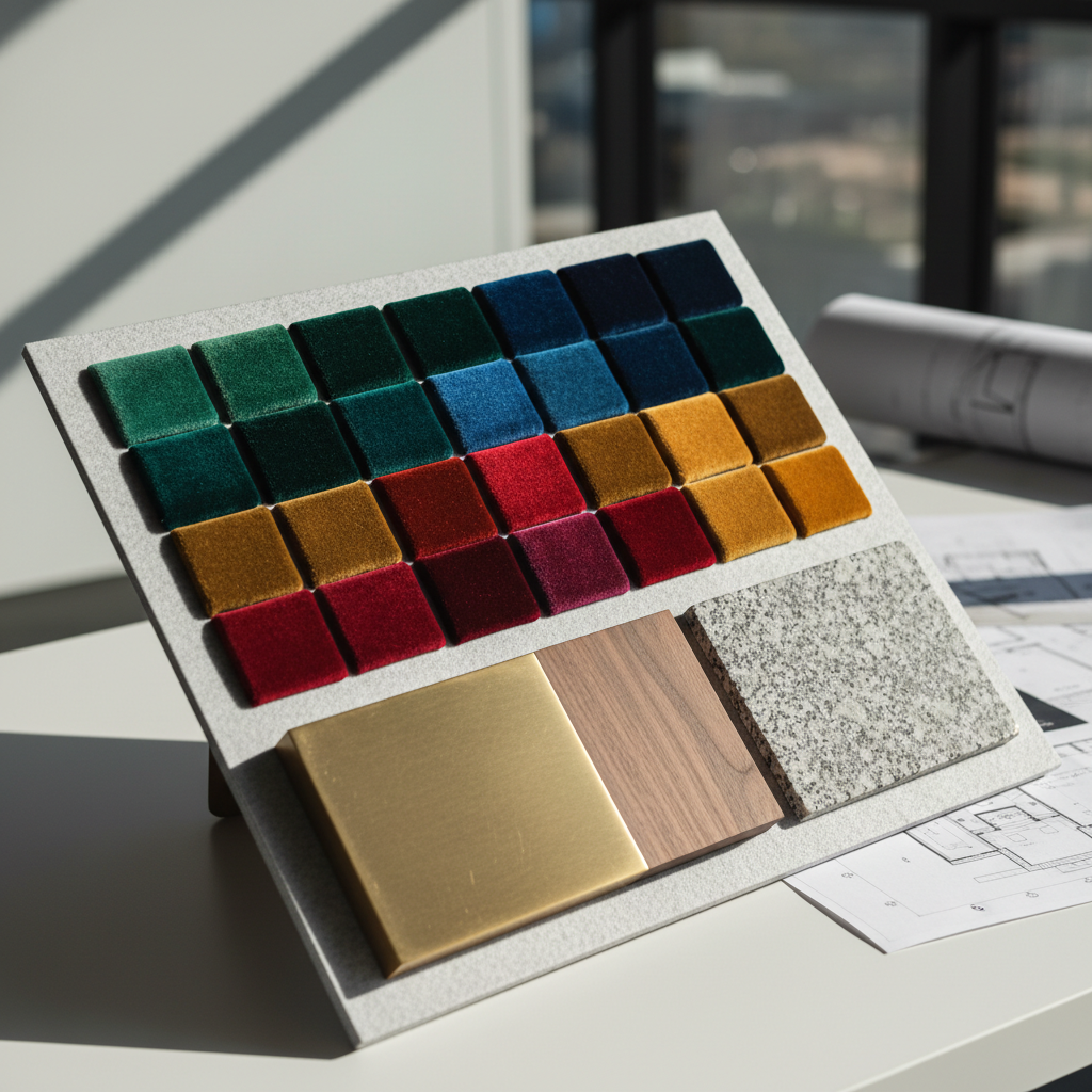
The Metropolitan Museum of Art describes a 15th-century Italian panel as pile-on-pile cut, voided, and brocaded velvet with silk and metal-wrapped threads. That wording sounds historical, but the practical lesson is current. Velvet is not one category. A cut pile catches light differently from a voided ground, and both behave differently from a flatter woven silk. A designer who ignores structure and selects by color chip alone gives up one of the strongest tools available in a luxury room. Source: The Met, Panel of velvet.
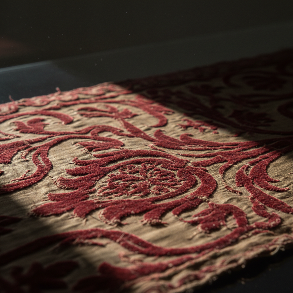
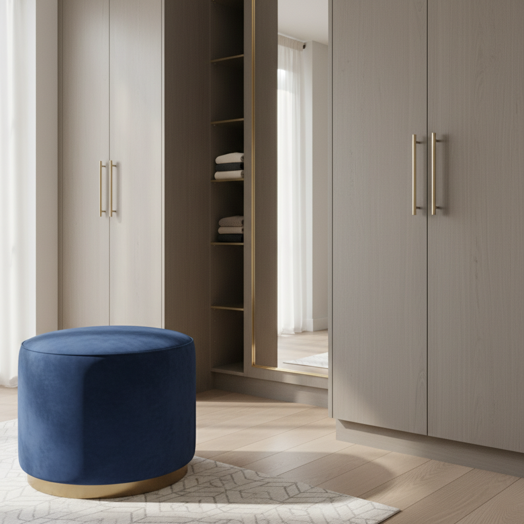
Daylight reveals that difference before color does. In a wardrobe room, a velvet panel can look dense and shadowed in the morning, then brighter and more articulated in late afternoon when the light reaches it at a lower angle. That is why panel placement matters. A low-contact vertical plane beside cabinetry or opposite a window can make better use of velvet than a seat edge or narrow drawer-front detail.
Silk also rewards distance. Britannica’s overview of sericulture is a reminder that silk starts as a filament fiber rather than a short staple. That helps explain why silk textiles can deliver a cleaner line, sharper pattern definition, and more controlled sheen than many heavier upholstery solutions. In a dressing room, that visual precision belongs where the eye scans first: wall panels, framed textile inserts, or the inside face of a screened alcove. Source: Britannica, Sericulture.
The room should still be designed as an indoor-use environment rather than a showroom. The EPA notes that people spend about 90 percent of their time indoors. That is a simple but important fact for material selection. Dressing rooms are touched, brushed, and lit every day. A finish that looks impressive in a staged photograph but collapses under repeated use is badly specified, no matter how expensive it is. Source: EPA indoor air research.
The visual result is strongest when velvet is treated as a directional surface. If the panel rhythm aligns with daylight, pile fabrics create movement without noise. If the room already contains strong grain from timber and strong reflection from mirrors, a more restrained velvet with less contrast between ground and pile usually performs better. The room stays rich without becoming restless.
That is why texture often reads before color in high-end dressing rooms. Viewers register the surface change, the depth of pile, and the way light pools across the textile before they name the hue. Good specification uses that sequence. It lets the fabric do quiet work at close range instead of asking it to shout from across the room.